
Mari Wigham is a data engineer at the Netherlands Institute for Sound & Vision, working on innovative ways of helping researchers to work with the archive. She combines her experience in the media with her knowledge of semantic technology, to unlock media archives for researchers and to provide them with new insights from the data. In June 2022 Mari joined MediaNumeric for its second course in The Hague where she gave an insightful lecture on strategies of data search, including big data. How can you communicate effectively in the nuanced world of data? And how do we distinguish fact from fiction? Mari gives her opinion.
Archives, media and data
For some, the link between archives, the media and data may be somewhat unclear. But that is exactly what Mari’s job at Sound & Vision entails: “The archives at Sound & Vision store a vast amount of interesting data, and researchers from academia and the media reach out to us when they want to retrieve certain data. This could vary from data about the Dutch football team’s participation in World Cup matches, to the representation of men and women in the media over time.”
Mari’s main goal as a data engineer is to help people answer questions. “We get questions from lots of different organisations. Mostly it’s the researchers and journalists at these organisations who reach out to us. We then provide them with the data, the tools and the methods to answer their questions and we’re able to do that thanks to the incredible data infrastructure that we’ve built at Sound & Vision” explains Mari. “For example, the Media Suite and our Linked Data endpoint. In the near future, we will offer more flexible access to the data via APIs and Jupyter Notebooks.”
Quick and dirty communication
It is incredibly important that the researchers and journalists, but also the data engineers themselves, either master multiple disciplines or work together in teams where these disciplines are all represented: “There are so many opportunities to do interesting things with data. But there are also so many instances where it can go horribly wrong if you don’t have the correct skill set. You can’t just learn how to use Excel or Python and think that’s enough. You need knowledge of the data, of the different tools, of statistics, and you also need knowledge of the topic you’re covering. You can’t research the elections, for example, without any knowledge of the subject matter” says Mari.
The really tricky part, however, is communicating your findings to the public. “There are so many details and nuances when it comes to data research. That’s why scientific papers are always so long. But at the same time you want to communicate your findings quickly and directly. You want to post a tweet or an eye-catching graph, which is only a snippet of the information.”
“People aren’t going to read a thirty page research paper. So how do you balance readability with access to all the details? It’s a real struggle.“
– Mari Wigham
Recognition and interpretation
It’s not only the complexity of communicating details that data engineers face in their work. Sometimes it’s the data and research tools themselves that pose an issue, because they are used for a task for which they are not suitable. “Nowadays, there are tools out there that conduct text analysis and even entity recognition. They automatically recognise mentions of places, people and organisations, for example, and that’s really convenient when working with big data. But it also brings its own challenges, as the results can be misleading if the words or entities do not appear in the data in the way you expect. For instance, I was doing some research on Covid in 2021, and at that point in time, people in the media weren’t necessarily saying the words ‘covid’ or ‘corona’ anymore. They were talking about restrictions, lockdowns, face masks… So even though Covid was still the topic, the tool didn’t pick it up because it wasn’t explicitly mentioned”, explains Mari.
Even when tools produce accurate results, the tools cannot interpret those results. This is the task of the researcher or data engineer, and it is essential that they take care to correctly interpret the results in context.
“Interpretation is often forgotten when there are so many nice tools out there. It’s easy to take the graphs and results as fact, but we mustn’t forget the importance of the human factor in the world of data.“
– Mari Wigham
Data in isolation can manipulate and deceive
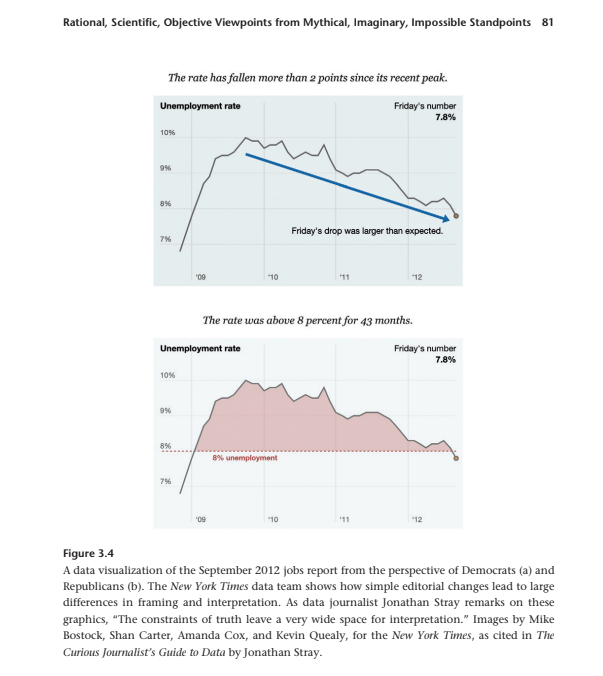
Mari would like to leave the MediaNumeric data journalists of the future with a final piece of food for thought: “Presenting data in isolation encourages people to take it as fact. But when you present data in context and with transparency about your own point of view, that’s when you truly show the public the full picture.” You can clearly see what Mari means in the below graphs. The same data can be framed as a drop in unemployment rate or as a consistently high rate over a period of time. Which graph you chose to share with the public relies heavily on your own interpretation, “but it is crucial that you don’t manipulate or deceive. Be transparent in your message – where did the data come from, what did you do with it, and how did you interpret it to reach your conclusions.”